
A bogus GHG emissions baseline would be a giant step backward for Sonoma County
Update: In response to this post and other developments, RCPA issued a statement and additional data on August 26. TSV appreciates that RCPA takes the questions we raised seriously, and we look forward to narrowing the gap in our understanding of the CA 2020 plan. We are continuing to explore these issues and will report back with more findings as soon as we can.
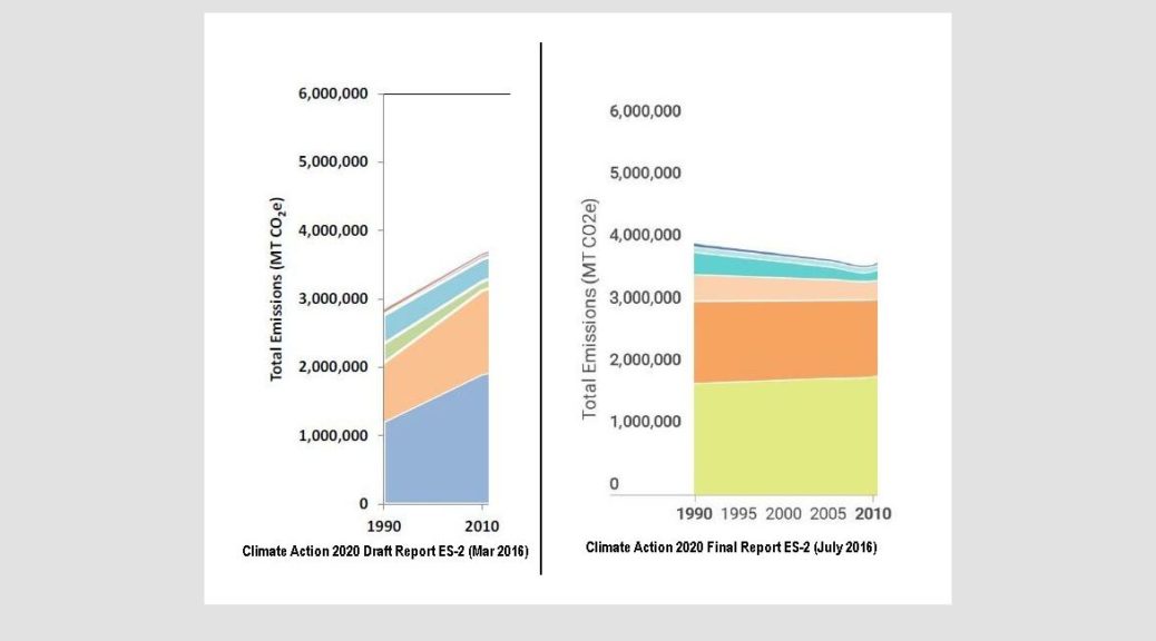
Sonoma County’s long awaited Climate Action 2020 (CA 2020) Plan is finally here. But what is wrong with this picture (Fig. 1)?
How did Sonoma County’s AB32-mandated greenhouse gas (GHG) emissions baseline — and even the direction of its 20-year trend line — change so dramatically in just the three months between the Draft and Final Reports?
Did the consultants hired to write the CA 2020 Plan make a serious error in their baseline analysis, or are they trying to rewrite history with a ‘backcast’ that is poorly documented and simply too good to be true?
Only the inattentive or the foolish will fall for this without a better explanation. Here’s how the fable currently goes.
Think back 20+ years to the bad old days, in 1990, before the Internet.
In 1990 Sonoma County had 72,000 (16%) fewer people than in 2010, each driving fewer miles on average a day. Yet somehow they tell us (Table 2-1) that cumulative traffic and building emissions in 1990 were much worse than they were 20 years later, even after a period of unprecedented growth in the wine, tourism, and housing industries, and a home equity boom (that went bust).
Absolute baseline emissions were truly awful in 1990, or so we are asked to believe. Although driving many fewer miles and powering 17% fewer homes, and with businesses employing 12% fewer workers, mysteriously we produced 9% more GHGs.
How can that be? Were baseline emissions really so much higher in 1990? How did the direction of this previously well-accepted trend get reversed and end up looking like this (Fig.2)?
What would happen if we tried to linearly extrapolate this new trend back to when Sonoma County had even fewer people, cars, and buildings? Would we conclude that General Vallejo and the Bear Flaggers produced far more GHGs than we do today?
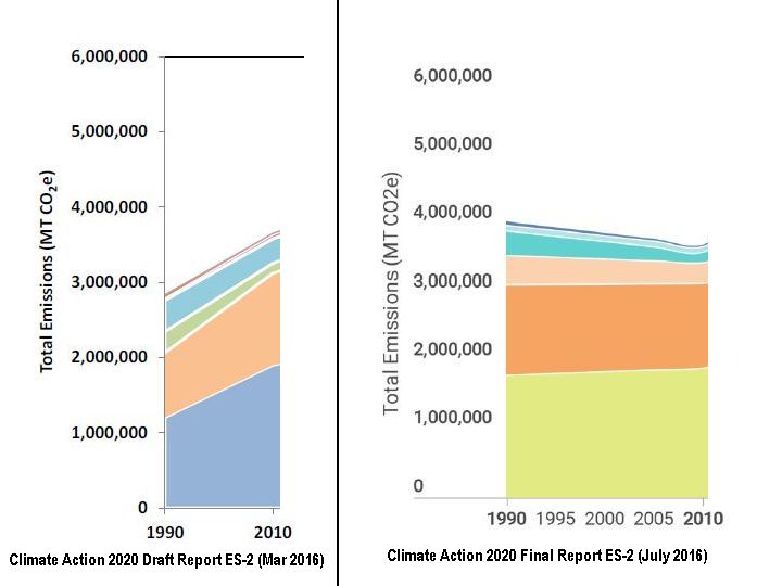
The Regional Climate Protection Authority’s (RCPA) post-2010 forecasts readily admit one thing. Unless we set ambitious new policies to curb them, GHG emissions will begin rising sharply after 2010 because of ‘Business-as-Usual’ (BAU). Indeed no one disputes that they have gone up already.
Rising emissions, of course, place our planet and our security in grave peril. The Final CA 2020 Report is full of numerous implementation measures to get the County and the cities working on solutions.
Yet are we to believe that somehow during the 20 years between 1990 and 2010, a period we all recall as the golden era of business-as-usual in Sonoma County, that our emissions steadily and spontaneously went DOWN?
Were Sonoma County’s GHG efficiency improvements really that exceptional, even as our population and our economy were growing so much? Even before local climate champions launched the Climate Protection Campaign in 2001, and our first community GHG inventories were completed in 2005?
If true, this would be unprecedented good news, not unlike the “Eat more, Weigh less!” ads we see in the tabloids. Did we really get to have our cake and eat it too, to drive and build so much more, while our total carbon footprint actually got smaller?
Has anyone else ever documented such a spontaneous BAU emission reduction trend of this magnitude — a steady decline over 20 years, despite significant economic growth?
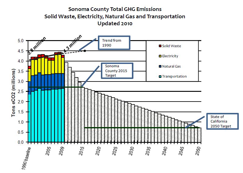
Not in the County’s first GHG inventory, performed by the Center for Climate Protection (CCP) in 2008, and updated in 2010 (Fig.3) . Notice the obvious and well-labeled upward slope of the trend line.
Not in the County’s next inventory, updated by the same CCP consultant in 2015 (Fig.4). Notice again the upward slope of the trend beginning in 1990 and peaking in 2007, before dipping temporarily during the recession. Certainly this trend seems to make sense, tracking in sync with other well-known economic indicators.

Was it there in the first inventories RCPA’s same consultants shared with stakeholders and other members of the public at the early stages of CA 2020 planning (Fig. 5)?
No again. Although the year-to-year spikes have been smoothed out, the same upward slope to the historic emissions trend remains unmistakable.
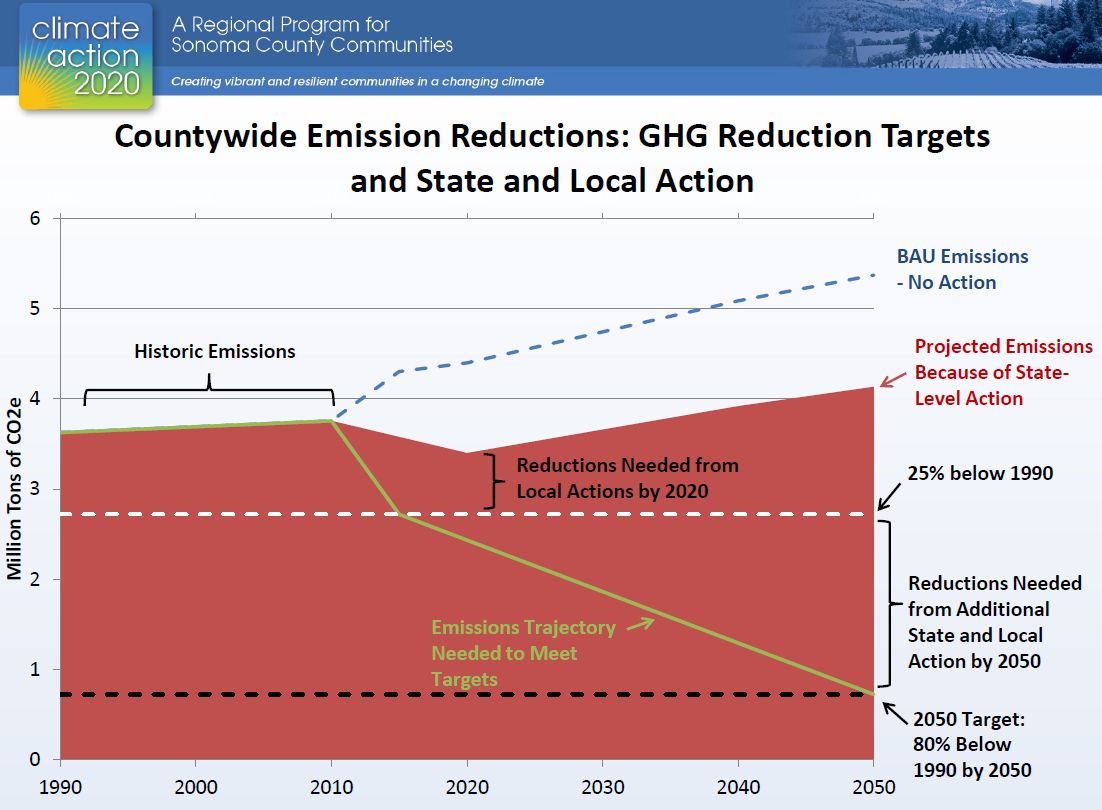
In fact, this unprecedented claim of a new trend direction was not even made obvious in the Executive Summary of the CA 2020 Draft Report circulated to elected officials, stakeholders, and the public in March 2016 (Fig. 6).
Notice again, the sharply upward slope of the trend, showing the 1990 baseline to be well below the 2010 estimate, and appearing to reconfirm what we all believed at the time to be the conventional wisdom.
To find out what may really be going on here we need to dive into the details of RCPA’s daunting CA 2020 Final Report (370 pp. 26MB, PDF), and especially the Inventory and Forecast Details in section B of its Final Appendices (272 pp. 9MB, PDF).
Bear with us, we have, and it’s worth it.
Section B3 begins with an acknowledgement that the previous inventories CCP prepared in 2010 and 2015 used “slightly different methods and data sources from those used in the inventory for CA2020, as data sources have expanded and improved, and methods for calculating emissions have grown more robust” (p.B-2). “Slightly different” is fine. This is normal and entirely to be expected.
Section B4 discloses that the year 2010 is being used as the Inventory Year, mainly because US Census and other reliable data were available for that year. Of course everyone knows that 2010 was atypical in that we were suffering the worst economic downturn since the 1930’s. But as long as it is done carefully, and checked to confirm it doesn’t distort what we already know about reality, we can live with it. So far so good.
Section B5 is where things start to get interesting. It explains that the new Sonoma County AB32 baseline will be set “primarily using socioeconomic information (i.e., population, households, and employment) for each emissions source to ‘backcast’ from the 2010 inventory” (p.B-3). Yes, they really put the scare quotes on ‘backcast’ so we know they agree this is getting creative.
But why should we need to ‘backcast’ the past? Isn’t that what actual data is for?
Now is the time to be on lookout for any potentially strange or inconsistent results that aren’t fully explained and documented. But these guys are supposed to be professionals so as long as they show us their math, all is still good.
Section B6 explains that the BAU forecasts through 2050 will also use the 2010 Inventory as their basis. This approach makes sense for a forecast, since we don’t have any other way to predict the future.
Section B7 discusses a clever method to fix some complications that result because some, but not all the cities annexed land from the unincorporated county since 1990. We are told this is necessary to “eliminate artificial decreases in GHG emissions for the unincorporated county for CA2020 planning purposes” (p.B-4). That’s fine, as long as it doesn’t result in artificial increases either.
Section B8 explains that the entire study is based on the U.S. Community Protocol for Accounting and Reporting of Greenhouse Gas Emissions (October 2012), maintained by Local Governments for Sustainability (ICLEI). This is essentially the same protocol that CCP used for its previous baseline estimates, so this shouldn’t create any problems.
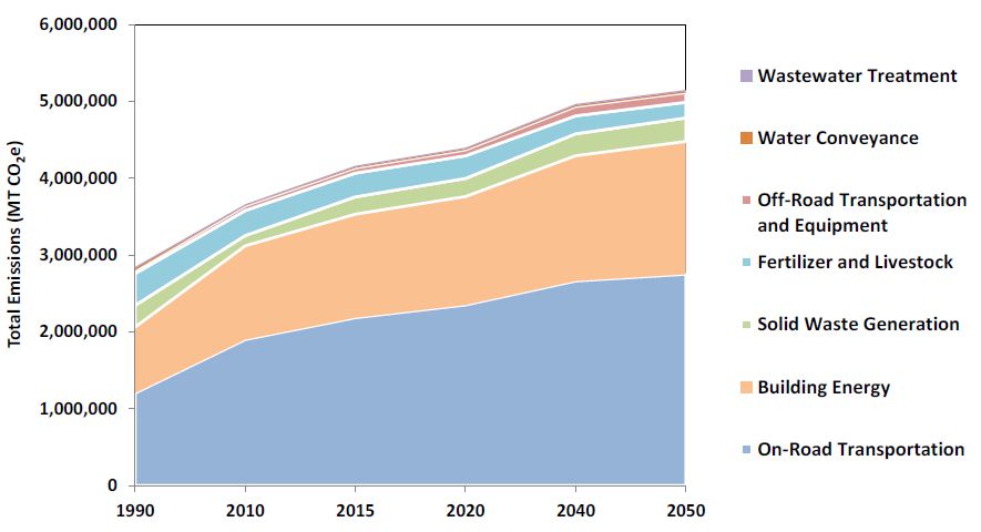
Section B9 is what we’ve been waiting for. It promises to outline all the data sources and models used in the calculations. Building Energy (B.9.1) and especially On-Road Transportation (B.9.2) are the main ones to focus on. No one disputes that together these two sources are responsible for the vast majority of total emissions, regardless which year or jurisdiction.
Each of these B9 subsections starts out with a short explanation about why CA 2020 differs from the County’s previous GHG inventories done by CCP (i.e., Fig. 3 and Fig.4 above).
In section B.9.1, they explain why they adjusted down CCP’s original electricity and natural gas emissions estimates for 1990 and 2010. In fact, they found CCP’s 1990 electricity emissions factor about 9% too high, while basically accepting their 2010 estimate unchanged. This obviously can’t explain the new higher 1990 baseline anomaly. If anything, it points in the opposite direction.
For On-Road Transportation, Section B.9.2 explains why CCP’s per-mile emissions factor and total vehicle miles traveled (VMT) estimates were also both adjusted downward (for both 1990 and 2010). Taken together, we calculate that adjustments to these two factors would reduce CCP’s original 1990 baseline on-road transportation estimate by a whopping 32%. Again, this would tend to decrease the baseline and increase the upward slope of the 1990 -2010 trend that CCP estimated, not reverse it (i.e., more like Fig. 6, than Fig. 4).
This also sounds more like the rural Sonoma County we remember in 1990.
Unfortunately, unlike most technical appendices we have reviewed in the past, Appendix B is presented mainly in a narrative or story-telling format. Transparent model specifications, equations and other data that might build greater confidence in the results have simply not been provided.
Nor are there any explanations for some of the more unusual methods used that appear to go beyond generally accepted GHG protocols (e.g., the 1990 ‘backcast’ VMT interpolation methodology, how 1990 Highway Performance Monitoring System data was apportioned to communities and speed bins, how this compared to CCP baseline VMT estimates, why RCPA’s parent agency, the Sonoma County Transportation Authority (SCTA) assumes when calculating VMT that a year is only 347 days long, etc.).
Because otherwise we’re at a dead end, let us return for a moment to Section B5. It contains a key statement that might help us narrow down where the bizarre results we saw above might be coming from:
“The development of a 1990 emissions backcast for the communities allows for the comparison of the GHG inventory, forecasts, and effect of GHG reduction measures to 1990 levels per the countywide GHG reduction target” (p. B-3, emphasis added).
Let’s compare these communities and see if they all show the same trend reversal that we think doesn’t make sense.
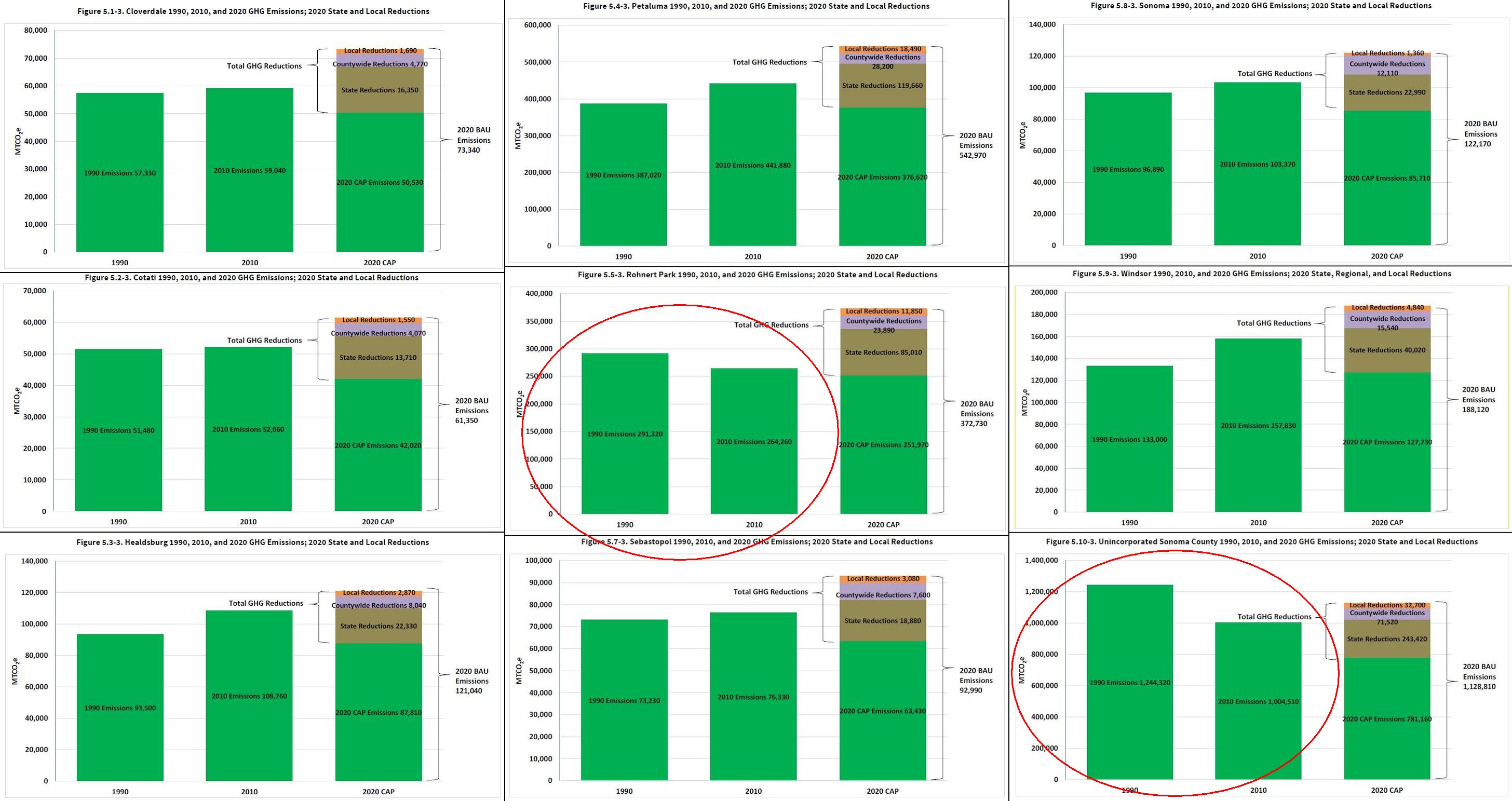
Well look at that! Only the two communities that were subject to annexation-related boundary adjustments show the untenable inverted trend. That’s Rohnert Park (center), and the Unincorporated County (lower right). Table 2-4 contains the actual numbers, as well as Santa Rosa’s new estimates (which were never graphed), but which also show a 1990 baseline estimate that is absolutely higher than its 2010 inventory. All seven of the other jurisdictions do not.
This is a RED FLAG that there may be an error in the annexation, VMT allocation, or Santa Rosa integration methodology, somehow double-counting or otherwise inflating 1990 baseline levels for Rohnert Park, Santa Rosa, and the Unincorporated County (but not the other seven communities).
Table 2-4 also provides estimates for Santa Rosa (not shown in Fig. 7), which in its independently prepared Climate Action Plan had its baseline defined at 15% below its 2007 inventory. However, now it has been assigned a new 1990 baseline that is 5% ABOVE its new 2010 inventory. What’s going on here? Again, this major change has not been adequately explained.
Unfortunately RCPA and their consultants have failed to document their work in sufficient quantitative detail to allow anyone to replicate it. In fact, RCPA staff had quietly let it be known (at least as of April of 2016) that they too have had difficulties getting some of the key variables and other numerical drivers out of ICFi (the consultant whose work is here in question).
Why haven’t RCPA staff and trusted climate policy watchdogs like CCP, SCCA, Sierra Club, NRDC, Environmental Defense, 350.org and others raised any of these concerns publicly already? Why didn’t RCPA staff answer these and numerous other questions and requests for documentation when we first posed them in our written comments back in May?
Cynics will argue that some of these groups may have already been co-opted by powerful interests with a stake in maintaining the status quo. An artificially higher baseline in 1990 means, at least in theory, that we get to emit more GHG pollution in 2020, 2040, 2050 and beyond.
At this point, we at Transition Sonoma Valley still think County staff and our environmental advocates deserve some benefit of the doubt. We realize that they are staffed by busy people who generally still have faith that Sonoma County can be trusted to lead on climate policies without much oversight. The most likely reason is that they haven’t yet had the time to review the CA 2020 report in all its complexity.
But our trust in RCPA has been shaken.
Regardless, soon we will know for sure, when they choose to either join with us to question this version of the 1990 “backcast” baseline, or to defend it in its present form, despite these serious questions we have raised.
By no means do we intend to denigrate the entire report. We acknowledge it still contains a great deal of valuable information. We just want to see it fixed and finished.
We’re also pleased that it seems to have helped get the jurisdictions planning their long-anticipated local GHG mitigation measures in earnest. These local planning discussions should continue while RCPA works these bugs out. Time is of the essence.
But numerous unanswered technical questions, the failure to address directly any jurisdiction’s own vehicle fleet and building emissions, and even quality control and citation flaws that we identified in the Draft Report but were still not fixed (such as Fig. 8), all leave us skeptical that we’ve really gotten the quality of work product we had hoped for.

If the people of Sonoma County hope to maintain our international reputation as a leader in climate action governance, we think we deserve better.
Until our questions are resolved, and we have more confidence about why our established GHG baseline trend changed, we urge elected officials throughout the County to hold off on adopting the Climate Action 2020 Plan in its present form.
Editorial Team – Transition Sonoma Valley:
- Tom Conlon
- Ed Clay
- Tim Boeve